Catalyst App
Swipe on ideas, not faces
At-A-Glance
A social platform that helps people connect through ideas and projects, not profiles. Designed to spark unexpected collaborations between creators, researchers, and dreamers from different disciplines.
THE PROBLEM
Four PhD students believed that names and titles biased collaboration, so they wanted to try a different approach: anonymise identities, borrow the swipe from Tinder to make discovery fun and seamless. So they asked me to design a high-fidelity app around it in 4 weeks.
EMPATHISE
"Assumptions are good starting points, but real change demands validation through research" 🤓

However, with no time for formal research, I ran a two-week guerrilla sprint: a quick survey (n = 60) and coffee-fuelled hallway interviews with anyone I could catch (n = 18).
Then I analysed the findings and, surprise: people liked anonymous ideas and the swipe, but many called it “fair yet too empty” and wanted at least one trust cue to feel comfortable.
P.S. A quick snapshot of the survey results (n = 60):
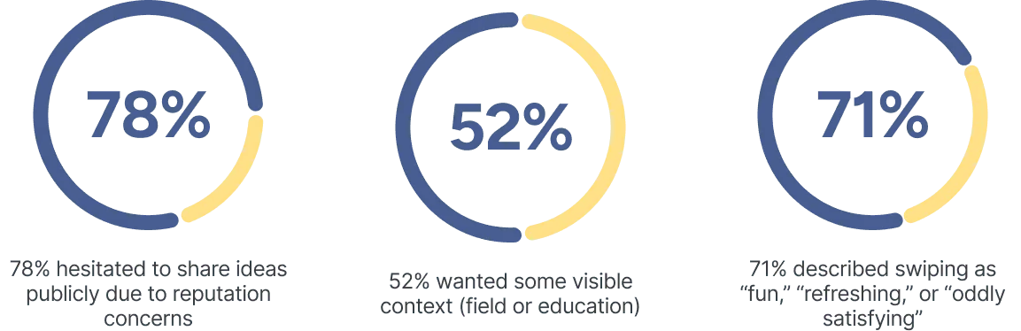
💡 In UX terms, the PhD team’s direction created a credibility gap: their idea tackled bias, but unintentionally weakened trust. 💡
IDEATE
This is where my job shifted from just designing screens to balancing research evidence with a very opinionated PhD team.
When I shared the findings, I expected a quick pivot. Instead, the PhD team doubled down: “Any visible background detail reintroduces bias. That is exactly what we are trying to avoid.” And since the clock was ticking:
So what did I do?
I turned the conflict into a plan: ship anonymity first, watch the real behaviour, and then decide how much context to add later.
The team agreed, so we kept the build moving instead of getting stuck in theory.
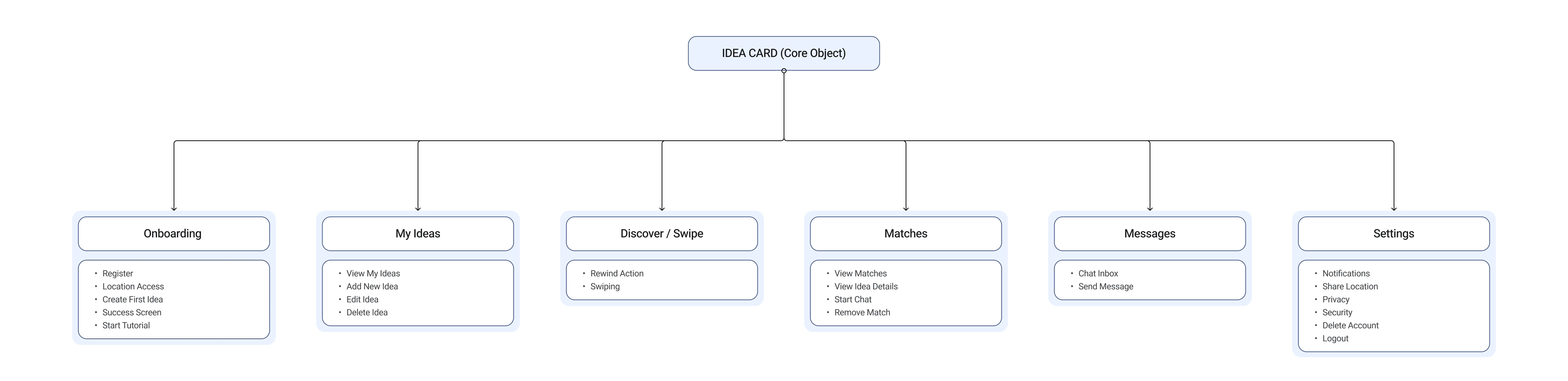
Once the team agreed on the plan, I locked the requirements into a clear IA, our shared contract for what we were building. It clarified scope and gave me the green light to jump into high-fidelity design.
PROTOTYPE AND TESTING
Now for the fun part, the actual screens👇
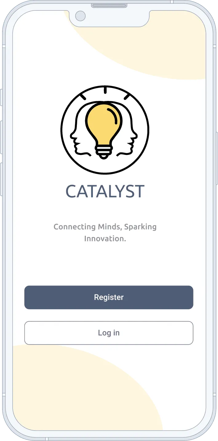
Visual Language
Neutral palette inspired by Material Design; soft ivory, muted navy, gentle grey, and warm yellow.
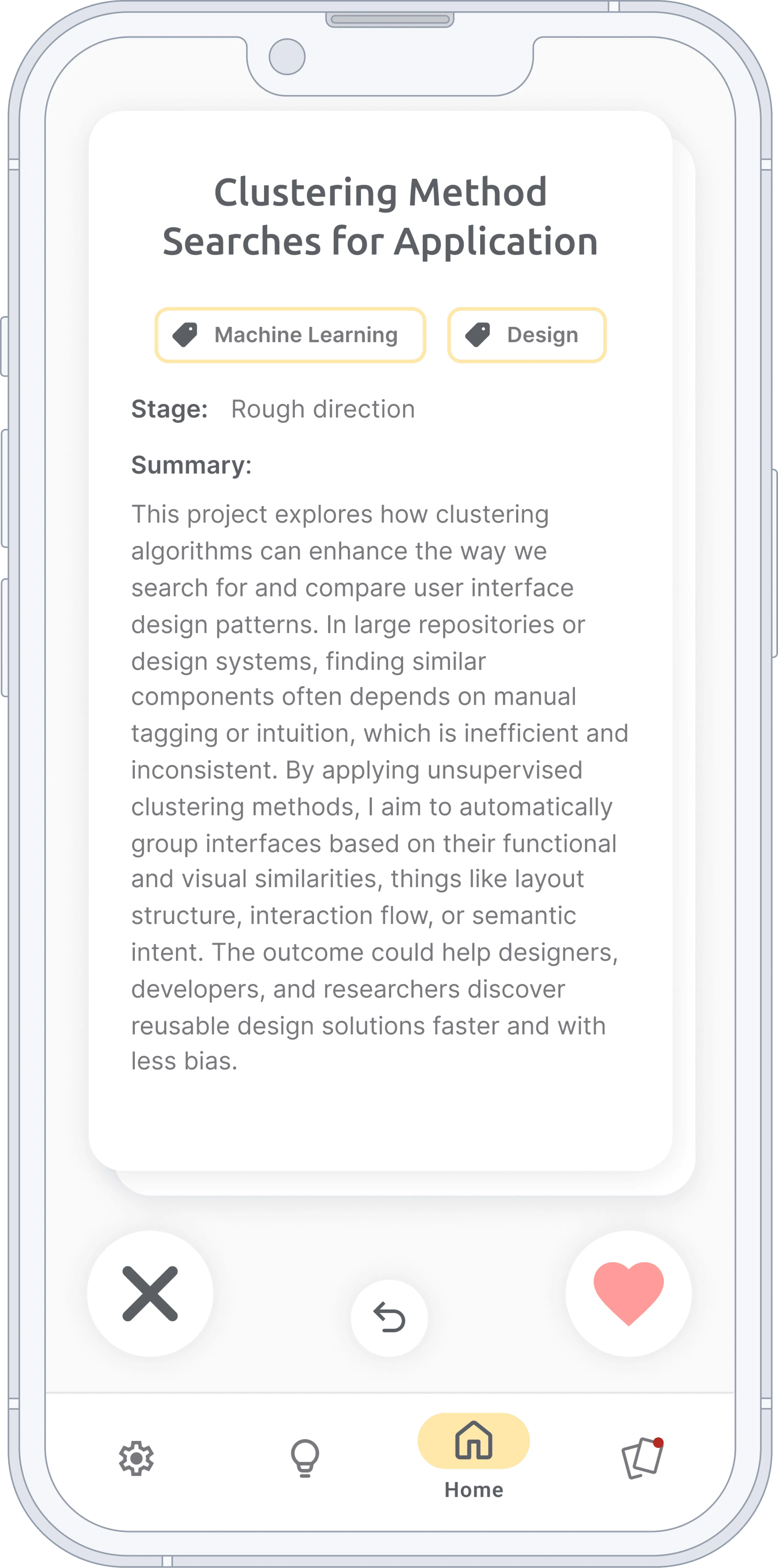
Anonymous Idea Cards
Each card included a title, short summary, tags, and stage. Reinforced fairness and focus on content.
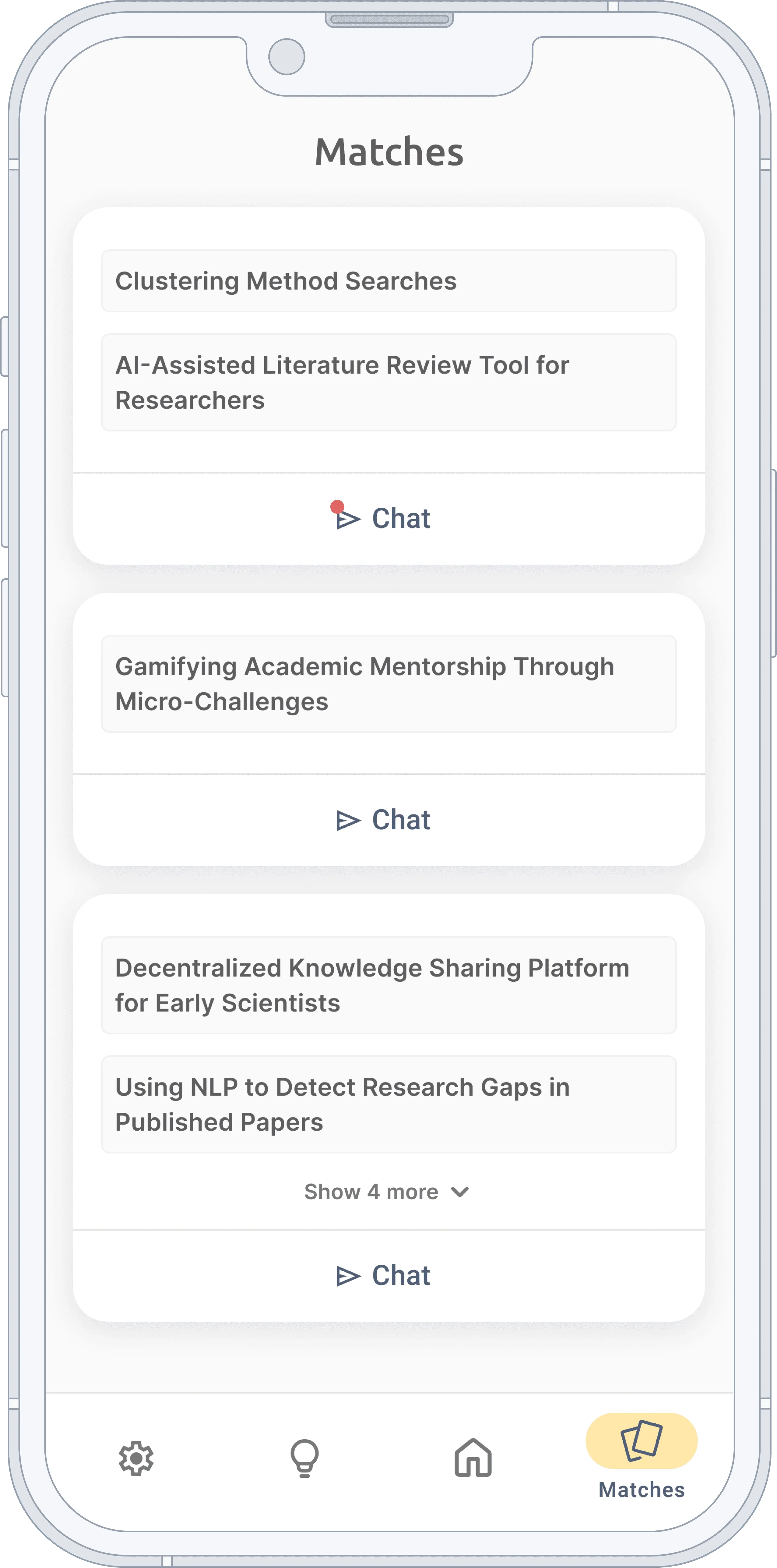
Matches Overview
Because profiles are anonymous, each match is displayed through the ideas/projects you have liked from another user, not their name.
This keeps interactions bias-free while letting users choose which ideas to explore or start a chat about.
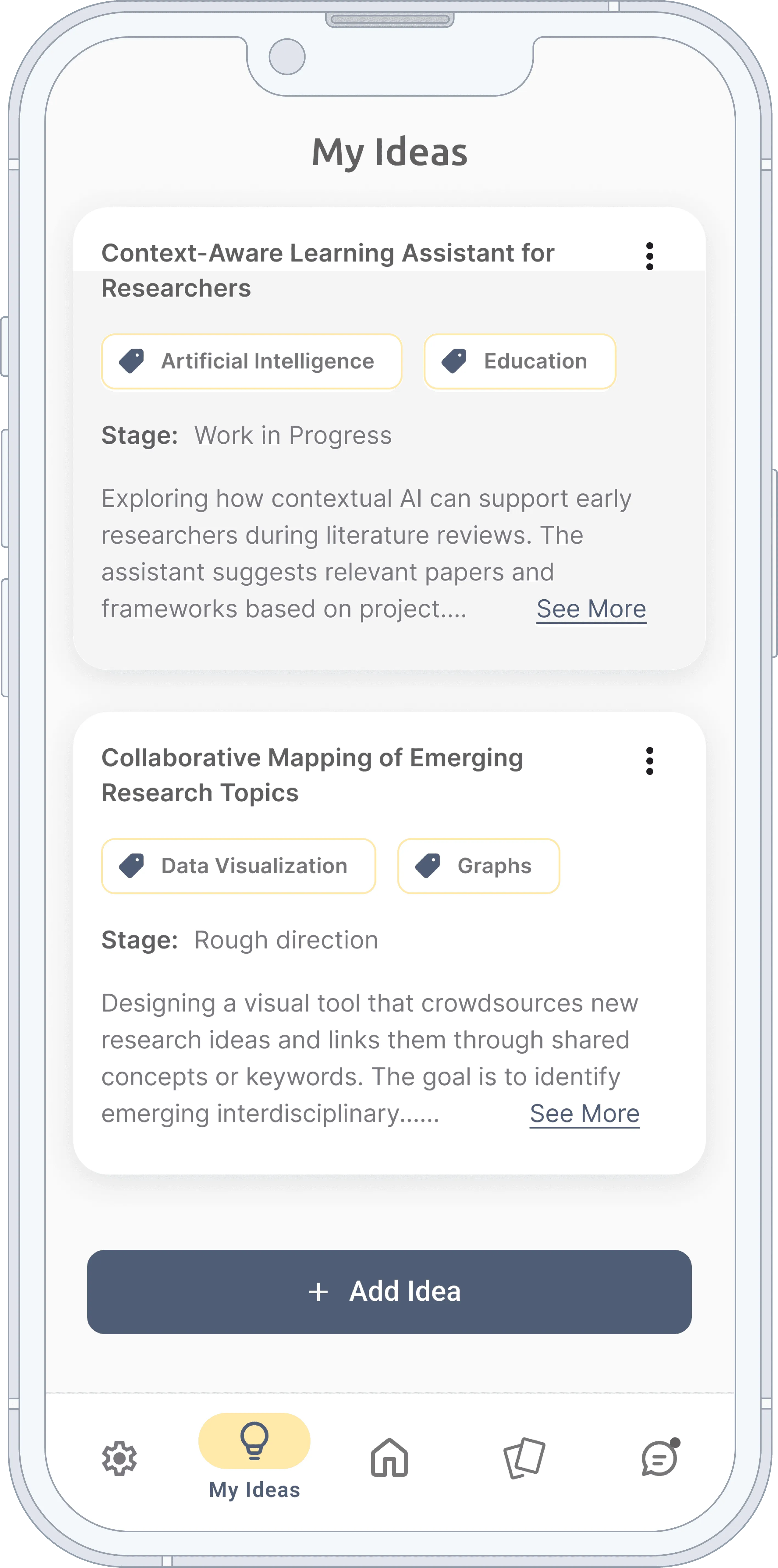
My Ideas
A simple hub to manage your own projects and ideas.
The prototype held up smoothly in usability tests (n=8), but some users felt unsure about where to start, so I created a quick onboarding tutorial to remove that friction.
The refined prototype became the demo and build reference for the team.
Reflection
Here’s the thing about working with brilliant people: their ideas often sound so convincing that it becomes very easy to skip validation. And to be honest, with the deadline and the exciting concept, I almost did the same.
But data said otherwise. Anonymity can remove bias, but it also kills trust. In the end I had a choice: just say yes and ship what was asked, or act like a real product partner and push the team to stop and rethink. I chose the latter, even though it risked annoying my teammates.